tirsdag 17. juli 2018

On the podium: DDR #723, #B124-B125 (1964)

These designs, issued for DDR's national stamp exhibition of 1964, looks decidedly modern to my eyes. I would even call them before their time. DDR stamps from the late 1950s to the 1970s are often dull, staid and unimpressive. So this SOS set stands out in my opinion. The message on the light green and the blue stamp chosen for inclusion is one of peace and friendship.


Since I'm such big fan of engravings, it feels nice to present Albrecht Dürer (1471 - 1528) on a stamp on stamp issue. Dürer was a great renaissance painter and engraver and this, the 3rd in the set, is a litographed copy of a painting he did in Amsterdam in 1521, called "Portrait of Bernhardt von Reesen".


Strangely and confusingly the inscription on the stamp says that the picture is called "Portrait of a young man" (Bildnis eines jungen Mannes). But that is actually what at least two other Dürer paintings are called today, and not this one. However, one should bear in mind that the title "Portrait of a Young Man" has been given to carloads of "old masters" for the simple reason that we don't know the name of the person on the portrait. And the "von Reesen" identity seems to be unconfirmed. Still, this is a minor stamp mystery. The real painting can be seen in The Gemäldegalerie Alte Meister in Dresden. Here is a full-color copy of it:


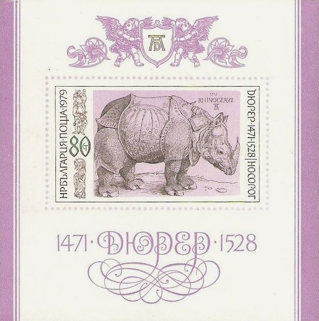
Btw: I'm very fond of a woodcut Dürer made of an Indian rhinoceros in 1515, which he based on a second-hand report of an animal he hadn't actually seen. He gave it a small extra horn on the back, scaly legs and some other antediluvian features that makes it look like a rather strange animal, like a cousin of a monster from the Book of Revelation. I have seen that print in many books about natural history in early modern Europe. I'm sure that Dürer thought this was the real animal on which the legend of the unicorn was based.

The iconic rhino woodcut is seen below, together with a miniature sheet issued by Bulgaria in 1979 (not my scan), in connection with a set of 4 stamps with other Dürer engravings. Below it you can see a version from the Maldives which I found in my collection of miscellaneous stamps. Dürer's art can be found on many stamp sets from many different countries. One could even start a special collection of Dürer stamps.


mandag 16. juli 2018

On the podium: Brunei #317-19 (1984)

From a former sultanate to an existing one: Brunei (or Brunei Darussalam - darussalam meaning "abode of peace"). This sultanate, a part of the great island of Borneo, was established as long ago as 1368 (the same year that Tamerlane became the ruler of Samarkand and the Chinese Ming dynasty was established). The current sultan, Hassanal Bolkiah, who is also prime minister, minister of finance and defence and probably much more, has been on the throne since 1967 and is quite well-heeled. His money comes from oil. He's got a big car collection. I don't think he collects stamps, cause modern Brunei stamps are nothing special to look at, even if the sultan's head can be seen on most of them.

These three were issued on occasion of PhilaKorea - Korean World Philatelic Exhibition in Seoul 22-31 October 1984 - and are among Brunei's better ones. They celebrate Brunei's older and better stamps in a good way.


The 50 cent blue shows Sultan Omar Ali Saifuddin, the father of the present-day car collector. It is an extremely fine engraving and a top quality print. That's why I give it a special place of honour here. If only all stamps had as much style as this one...


søndag 15. juli 2018

On the podium: Kedah 1912 (Malaysia 2012)

I suspect that the Malaysian stamp designers who found the old Kedah stamps for this set wanted to make it difficult for us SOS collectors to find copies of the stamps depicted. I haven't been able to discover any varieties with that particular dark green color as on the 1 cent stamp, and I can't find a 50c plower-and-oxen with that lilac/mauve frame color either. Not from 1912. They could be from the later 1920s reissues, but 1912 is the year of commemoration. The red-framed 5 dollar (showing the Council Chamber in Alor Star, Kedah's capital) is also impossible to find from the year 1912 on that yellow-toned paper. So I gave up finding exact examples. Instead I present my "incorrect" finds. The 1 dollar will have to substitute for the 5 dollar. Of course, it could be that the printers for the Malaysian stamp office failed to reproduce the colors properly, but the general high quality of the printing makes that rather unlikely.


But what is much more important than the strange color shades: The stamps on these stamps exemplifies some features that make stamp collecting fascinating: A strange country of unknown location (Kedah), strange writing, strange letters, exotic locales and motifs, intricately engraved ornamental frames, pleasing color combinations - all in all, good handicraft way beyond what is necessary for a piece of paper that is just a receipt for postage paid. 

Kedah was one of several minor sultanates on the Malayan peninsula that once was part of the British Malayan states. It doesn't exist anymore as a stamp-issuing country, but has become a part of Malaysia. The same is true of several other sultanates who also issued stamps: Perak, Selangor, Negri Sembilan, Pahang...

The mysterious fascination for these stamps would diminish if there still was a Kedah. Better to have the Kedah stamps as relics from a "lost land".

On the podium: French Southern and Antarctic Territories #258 (1999)

Terres australes et antarctiques françaises, shortened TAAF, is a strange stamp-issuing entity. It consists of some scattered and disputed islands close to or south of Madagascar and some other islands close to the Antarctic, in addition to a slice of Antarctica itself (Adélie Land). Do they really need stamps on these godforsaken islands in remote, icy waters, largely unpopulated and with no post offices in sight? Maybe. Some 50-100 scientists and researchers have been living on different research stations within the TAAF area from the 1950's on. Still, there is no doubt that TAAF stamps are produced largely for collectors. And by issuing TAAF stamps regularly, France can point to a sort of official authority over these islands, always a good thing for a nation that wants to be a player on the world stage. The historical connections are indisputable; several of these islands were first discovered and mapped by French explorers in the 18th and the 19th century. But the dispute about land claims and ownership is not for this blog to decide. I found quite a lot of interesting info on TAAF here and here.

There are lots of beautiful and interesting stamps in the TAAF catalogue well worth collecting. Naturally, most of them look like they come from France. Usual motifs are scenes from the exploration and mapping of the islands - their history, their wildlife, their biodiversity. Birds, penguins, volcanoes, whales, sea lions and other forms of marine life is prevalent. They are popular among collectors. I have been tempted to start collecting TAAF stamps myself, but I find many of the engravings a bit too heavy-handed and industrial and the stamps are far too often too big. Then on to the SOS:


This TAAF SOS sheet set from 1999 gives us quite a lot of information without being overburdened or cluttered and cramped. I'm not at all sure that the conspicuous cancellation marks are real. They seem to send a clear message about ownership - a kind of "case closed" - you can almost hear the metal stamp handle push down on the paper with a loud "thump". But at least the old stamps are given enough space to become the center of attention.

The two Madagascar stamps (the orange and brown portraits) are from 1946 and come from a classic set engraved (or designed) by Jules Douy.  He was a painter and artist who also worked in advertising and as a poster designer. I have seen pretty accomplished paintings by him. He won several prizes for his engravings.

The Charcot stamp (Charcot was a famous Antarctic explorer) was done by Pierre Gandon (1899-1990). He is more famous than Douy. It is rumored that Gandon designed and/or engraved more than 1000 stamps for France and the French colonies. There is even an entry on him in Wikipedia.

The Madagascar overstamped "Terre Adélie - Dumont d'Urville 1840" is by Raoul Serres (1881-1971), another very productive French stamp designer and engraver. He also illustrated books (Flaubert's Trois contes for instance) and designed postcards. So with a little luck, you may one day find a Serres-designed postcard with a Serres-designed stamp on it! Here is a list of stamps by Serres. There is a short entry about Serres here.

And to round off: Dumont d'Urville (the name mentioned on the Adélie stamp) was a great French explorer who discovered Adélie Land in 1840 and named it after his wife. John Dunmore has written a book about him.


lørdag 14. juli 2018

On the podium: Republic of China #784-5 (1948)


Every stamp tells a story, and the plot thickens when you can't read the text on the stamps because you don't know the writing. These two SOS (the red and green one)  were issued by The Republic of China (ROC) one year before what we know today as The People's Republic of China (PRC) was established on the mainland in 1949. The old republic government continued on Taiwan. The main banner says: Youzheng zongju chengli wushi zhounian jinian. This means "post authority commemoration day stamp exhibition". The boat-and-plane stamp is from a set issued only one year before (1947), and the other one is a portrait of Sun Yat-sen (1866-1925), the republic's first president and "father of the nation", issued in 1912. More details about this commemoratives can be found in the ROC section on Rammy Molcho's wonderful website Stamps on Stamps Virtual Collection.

Bonus: #776

As a bonus I'm including another one that belongs to the same 1947 set that the boat-and-plane stamp came from. An excellent line engraving depicting some of the main means of transport needed to conevy mail across the vast territory of mainland China, which is delineated with borders on the map in the middle. The text indicates: In commemoration of 50 years of the Postal Directorate. It doesn't mean that the first Chinese stamps were issued as late as 1896 (under the Qing dynasty). Local area stamps were used long before that. But internal administrative changes in the Chinese postal system in the 1890s is perhaps not as interesting as dwelling on the beauty of the stamps themselves? I really like these line engravings. (Thanks to Otto Malmgren for the Chinese translations.)


On the podium: Hungary #C236-47 (1963)


This classic 1963 set of 12 space stamps has always been very popular. I remember seeing them often as a child, both in my own collection and in my friends'. I don't think I ever saw the whole set, though, and definitely not with the original stamps as companions. So I couldn't stop until I had them all.

1963 was only two years after John F. Kennedy announced that NASA was working towards the goal of sending a man to the moon. They had to catch up with the Soviets. Maybe he was partly spurred on by the kind of propaganda these stamps represent.

I quote Monica Rüthers from the book Soviet Space Culture (Palgrave Macmillan 2011): "The Soviet space flights were acknowledged as 'peak performances of socialism', even in the eyes of the capitalist rival. The Soviet lead in the competition of systems was widely exploited in media coverage and propaganda, inside the Soviet Union, in the socialist countries and in the Western world alike. Sputnik could be seen and heard from all over the world. Outer space became part of everyday culture in East and West. To strengthen the bond of friendship between the socialist countries, the Soviet Union let the brother countries participate in the glory of space travel. Soviet cosmonauts visited the brother countries. Stamps with space motifs were created in Poland, Hungary, Czechoslovakia and the GDR, and from 1978 on those countries were invited to join Soviet space missions in the so-called Intercosmos Programme."

So the stamps on the stamps are actually just a few years older than the stamps themselves. The overall message is that we have a great era of cosmic space travel ahead of us, with Laika and Gagarin as pioneers worthy of cosmic fame. They go well with the books of one of my favourite authors: Stanislaw Lem.


søndag 8. juli 2018

On the podium: Norway 337-342 (1955) & 584-585 (1972)

Norway 337-342

The second Norwegian SOS issue came out in 1955. The occasion was the centenary of the first Norwegian postage stamp, and in that connection an international stamp exhibition called Norwex was held in Oslo. It was commemorated on an additional overprint set. The choice of noteworthy stamps is logical: The first stamp of 1855, one of the first posthorn issues from 1872, and one from the first "riksløven" set, the national emblem or "Lion Rampant", from 1924. These SOS designs are not among my favourites. I would call them acceptable at best. No room for brilliant adornments.


Norway 584-585

The celebrated posthorn design has been in constant use in Norway since 1872. They were issued in countless numbers in different values and colors and have become a special area for collectors. They even have their own magazine. So no wonder the Norwegian postal bureau found it worth a centenary issue in 1972. The great architect Wilhelm von Hanno is the man behind the posthorn design. Some detailed information can be found here. (Just ignore the top image in that essay, which shows a posthorn issue from Crete!) The intricate background of the 1972 design, consisting of many tiny posthorns in a tapestry pattern, makes these stamps more appealing to me than the 1955 issues. I had a hard time finding a good blue 2 skillings for a decent price, so I had to do with this badly centered and slightly shabby one. But it goes well with my second copy of the red 3 skillings, where the perforations have been cut.

onsdag 4. juli 2018

On the podium: Norway #1 & #B25 (1855, 1942)


The guy on the left on these stamps, beside the Norway #1 stamp (1855), is Vidkun Quisling. He was a hated man in Norway, and he was executed for high treason after World War II, having led a puppet government for Hitler's Third Reich. The majority of Norwegians would never sink so low as to put a Quisling stamp on an envelope if they could avoid it (and licking it to boot!), so it's rare to find these stamps in used conditions. They are much more common in mint, like these. So, if people didn't like to use them for postage, at least the collectors and stamp sellers liked to collect them as historical artefacts. They look very much like stamps issued by the German Reich during the same period.

The brown one has been in my collection for many years, but the blue one is new. So I thought there had to be a blue version of Quisling's head too, but no such stamp was ever issued. I didn't get the point: That they chose the blue color to represent the blue Norway #1 stamp.

As the text on the stamps indicates: They were issued in connection with a meeting of postal administrations in Vienna in 1942. Delegations from several German-friendly or occupied countries attended. It was an administrative move from the Germans to make communication during the war go smoother.

Concerning the 4 skilling Norway #1: It wasn't easy to find a cheap and good version of that stamp, so I had to dig deeper in my pocket that I usually do. Still, a Norwegian ought to have the first Norwegian stamp. It feels good.

I will soon return with more Norwegian stamps on stamps.

Below I present two other versions of the original Quisling stamp (Scott #B27, #B26).


tirsdag 3. juli 2018

On the podium: Crete 80 (1905) & Greece 380 (1933)

For Stamp Day in 1974 the Greek postal authorites decided to commemorate a rather striking and beautiful stamp issued by Crete in 1905. The 1905 stamp depicts an old coin showing a scene from Greek mythology: Zeus as bull abducting Europa (as the Scott catalogue explains it). As a European I don't like the idea of being abducted by Zeus. But of course, the mythological Europa came long before someone chose to name the continent after her.


Crete, formerly under Ottoman rule, issued their own stamps from 1898 until 1908, after which the island became an official part of Greece. Many of those stamps are nice collectors' items. Eye candy.

The ancient coin is in Scott called a "Cortyna coin". Cortyna is a strange spelling of the ancient place name Gortyn or Gortyna, today an archeological site 45 kms from Heraklion. And reading further in Scott: "The so-called revolutionary stamps of 1905 were issued for sale to collectors and, so far as can be ascertained, were of no postal value whatever." Well, nowadays they certainly have value for us stamp collectors.


Greece #380:

Greece #380 (1975) is another classic Stamp Day issue commemorating the nation's proud past. The head between the Doric columns is from a bronze statue made around 340 BC, popularly called "The Youth of Marathon". It was found in 1926 at Marathon Bay.